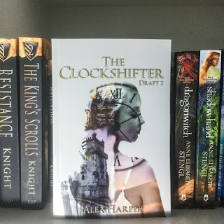
"Oh dear. That needs a new cover." (Or dubbed it a "self-published cover".)
(Please note that I am not bashing self-published books. Some of my favorite books are self-published. I am simply using a connotation commonly associated with bad book covers.)
And so we scroll past without even looking at the summary. People say to not judge a book by its cover, but they do it anyways.
Why?
The book cover is the first impression. If it is appealing to the eye, it will attract people to the second impression: the summary.
1. Perfect typography is key.
One of the elements that can make or break a cover is the positioning and font of the wording. Think of it as word art.
1. Look to the professionals for inspiration.
2. Pick a font that is bold, readable, and goes with your genre. (A fantastic place to look is dafont.com.)
3. Find the perfect positioning for your font.
4. Typography is an art!
Mess around and try something unconventional! Here are some great photoshop typography tutorials: http://design.tutsplus.com/categories/text-effects
5. Keep it readable.
Let's take a look at some examples.
 |
| This is a great example! The text goes with the color palette, is easy to read, and is bold enough to be the first thing that jumps out at you. |
2. Less is more.
Have you ever looked at a book cover and thought that it was way too busy? That's what you don't want to happen. Believe me, simplicity is best. (And right now, simple covers are what are "in".)
If you Google "best book covers of 2015", you will find that all of them have a sense of simplicity about them.
Here is a fantastic example of a simple, yet beautiful book cover: (Disclaimer: I have never read this book or know what it is about. I simply like the cover.)
Simply having a solid colored background is a good place to start with this, depending on the style of your book cover.
3. Have a color palette.
Make sure the colors on your cover go together.
4. The cover doesn't have to be a beautiful painting.
I know we all love those beautifully illustrated covers where the characters come to life. But we are not all painters.
5. Get a second (or third) opinion.
I don't know about you, but when I first create something, I think it is amazing and perfect. Then I send it to someone...and they don't like it nearly a much. This helps me realize my mistakes and how I can improve my work. Opinions are invaluable.
6. You might not get it right the first time.
A lot of times, it takes me a few tries before I come up with a design I actually like. Then it takes me more time to perfect that idea. (This is true for professionals as well.)
7. Make the cover intriguing.
The job of the book cover is to make the reader want to know more. Make sure you leave some mystery. :)
8. Know your limitations.
Not everyone can photoshop a person onto another background and make it look realistic. And that's okay. Try another style of cover. Have you considered a cover where the typography is the star of the show? What about finding another image?
9. Don't settle for decent.
If you have been working on a cover for a long time and it still isn't right, KEEP WORKING. Look for more inspiration. Ask someone for help. Maybe you could hire a professional cover designer.
10. Find inspiration.
There is no set way to make a book cover. As this is true, the best way to learn the art of making book covers is by studying professionally made book covers. Many times when I am ready to make a book cover, I will search for book covers and pick out what I like and don't like. From this, I will get a pretty good idea in my head of what it should look like.


![Pageflex Persona [document: PRS0000040_00028] Pageflex Persona [document: PRS0000040_00028]](https://blogger.googleusercontent.com/img/b/R29vZ2xl/AVvXsEiB6kC5oNIc_KTwHv3Wgy3QFPpcyjLny4oMUyYn7yrp5h_QC1E71JzLZvywAd6zxVbfdK3RnKRbDfkl9517u68sqdWrUbkqD-OumhrKQ6OkdJpONOoYFD63CL2mfKoQsVjrFluRTFdOqnEo/?imgmax=800)


